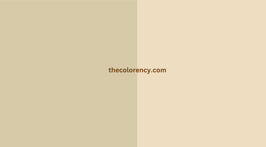
Are you considering a neutral color for your home décor? Accessible beige and balanced beige are two popular options, but it can be difficult to choose between the two. In this blog post, we’ll explore the differences between these two neutral colors and help you decide which one is best for your home.
What Is Accessible Beige?
Accessible beige is a light tan color with subtle yellow and gray undertones. It’s a warm, inviting color that can be used to create a cozy atmosphere in your home. It’s often used in living rooms, bedrooms, and other areas where people spend a lot of time.
What Is Balanced Beige?
Balanced beige is a slightly darker shade of beige with gray and yellow undertones. It’s often used in bathrooms, kitchens, and other areas where a more neutral color is desired. It’s a popular choice for those who want a calming, soothing atmosphere in their home.
How Do Accessible Beige and Balanced Beige Differ?

The biggest difference between accessible beige and balanced beige is the shade. Accessible beige is a lighter shade, while balanced beige is a bit darker. This difference in shade makes them suitable for different areas of your home.
Accessible Beige vs Balanced Beige: Room color
Accessible beige is best suited to rooms where people spend a lot of time, such as living rooms and bedrooms. It creates a cozy atmosphere that can make these rooms feel inviting and comfortable.
Balanced beige is best suited to rooms that require a more neutral color, such as bathrooms and kitchens. It creates a calming atmosphere that can make these rooms feel tranquil and peaceful.
Accessible Beige vs Balanced Beige: Pros and Cons
The main advantage of accessible beige is that it creates a warm and inviting atmosphere in your home. It’s also a timeless color that won’t go out of style anytime soon. The downside is that it can be difficult to match with other colors, so it’s important to choose your other décor carefully.
The main advantage of balanced beige is that it creates a calming atmosphere in your home. It’s also a classic color that can easily be matched with other colors. The downside is that it can be a bit too neutral, so it’s important to add some pops of color in your décor to avoid making the room look too bland.
Accessible Beige vs Balanced Beige: Best Color Schemes

The best color schemes for accessible beige are those that contain earthy tones, such as browns, greens, and tans. These colors will complement the beige without making the room look too busy.
The best color schemes for balanced beige are those that contain muted tones, such as grays, blues, and whites. These colors will create a soothing atmosphere without making the room feel too bland.
Accessible Beige vs Balanced Beige: Best Accent Colors
The best accent colors for accessible beige are those that are bright and vibrant, such as reds, yellows, and oranges. These colors will contrast nicely with the beige and add some life to the room.
The best accent colors for balanced beige are those that are muted and subtle, such as pastels and light blues. These colors will complement the beige without making the room look too busy.
Which Color Is Easier to Maintain?

Both accessible beige and balanced beige are easy to maintain, as they don’t require any special cleaning or upkeep.
Which Color Is More Durable?
Both colors are fairly durable, but balanced beige is a bit more resilient due to its slightly darker shade.
What Are Some Tips for Decorating with
When decorating with either of these colors, it’s important to choose your other décor carefully. Make sure to use colors that will complement the beige without clashing with it. You can also add pops of color to liven up the room and add some contrast.
Conclusion
| Category | Accessible Beige | Balanced Beige |
|---|---|---|
| Undertone | Neutral, warm undertone | Subtle greige (gray-beige) undertone |
| Hex Code | #D6CAA9 | #EEDDC1 |
| Versatility | Versatile, adaptable backdrop | Modern, adaptable and versatile |
| Ambiance | Creates a cozy and inviting atmosphere | Adds a contemporary and sophisticated touch |
| Accent Colors | Warm accents complement well | Pops of color enhance the modern look |
| Complementing Elements | Natural materials and textures | Contrasting textures and patterns |
| Lighting Influence | May appear warmer or cooler based on lighting | Undertones may shift depending on lighting |
| Recommended Style | Traditional, rustic, warm aesthetics | Contemporary, modern, minimalist aesthetics |
| Pairing Options | Works well with earthy tones, creams, and muted colors | Contrasts with darker or lighter shades, vibrant colors |
| Sample Testing | Always test in your space to see how it interacts with lighting and furnishings | Important to sample and observe its undertones in your specific environment |
| Overall Feel | Invokes a cozy and comforting vibe | Adds a touch of elegance and modernity |
Accessible beige and balanced beige are both popular neutral colors for your home. Accessible beige is best suited to rooms where people spend a lot of time, while balanced beige is best suited to rooms where a more neutral color is desired. Both colors are easy to maintain and fairly durable, but balanced beige is a bit more resilient due to its slightly darker shade. When decorating with either of these colors, it’s important to choose your other décor carefully and add pops of color to liven up the room.
